Here are three key things to keep in mind when creating your next masterpiece. (All photos via Pinterest)
Okay - so they're mostly stripes, but you get the idea!
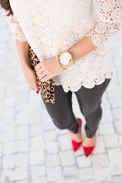
Color Scheme: Keep it neutral. Trust me, you'll regret that selfie in the Rainbow top and checkered pants. Since you're already daring to mis-match, keep one of them black, white, brown, gray, etc. Note: If you don't want to do all earth tones, Leopard print and stripes are totally neutrals too!


Scale: Keep in mind the size of the print you're mixing - keep one of them on the larger scale, and the other smaller. Ex: Large plaid with smaller stripes or polka dots. Keep rule #1 in mind too... if your larger pattern is bright or bold, keep the smaller pattern more neutral (or visa vera).


Texture: Think opposites: fur and silk, denim and lace, cable knit and leather. Fuzzy sweater + fuzzy scarf may = teddy bear... unless you're going for that look, stick with one or the other.


Happy mixing!
:)

Post a Comment